Case.08
Elastic Reveal: The Physics of Premium Loading
A breakdown of how we abandoned progress bars for narrative micro-interactions that reduced perceived wait times by 40%.
A deep dive into the technical craft behind Winetra's studio. We explore the friction between aesthetic purity and the brutal constraints of mobile hardware. No fluff, just the logic of the lens.
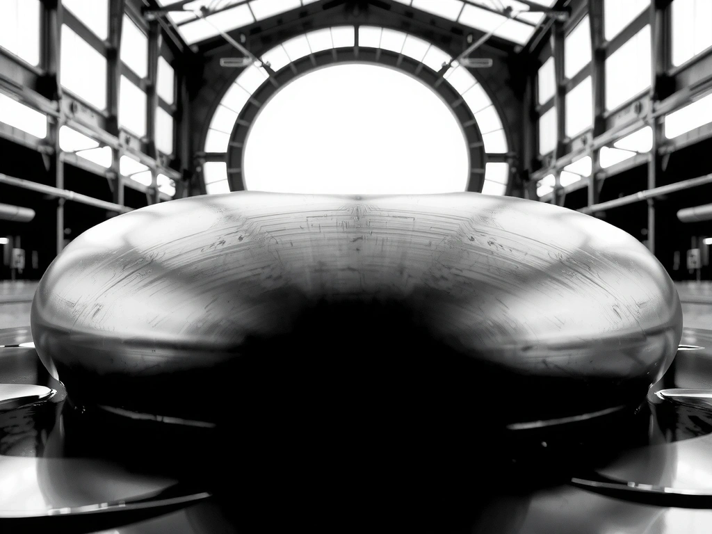
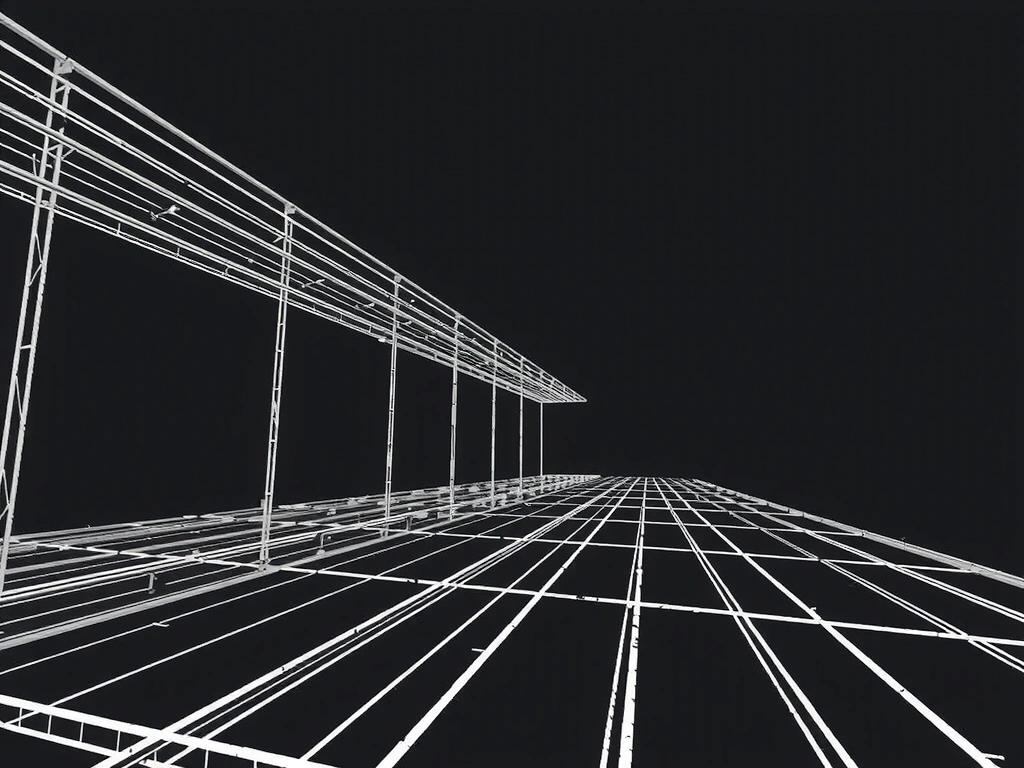
When we set out to build the Winetra aesthetic for our 2026 gaming suite, the "Glassmorphism" trend felt exhausted. Static blurs and simple opacity shifts lacked the tactile grit required for high-stakes Italian digital ateliers. We pivoted toward what we call "Liquid Chrome"—a shader-driven surface that calculates environmental refraction in real-time.
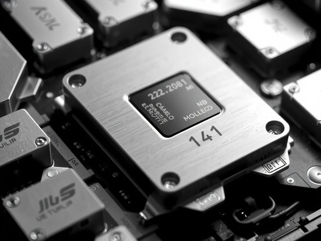
The challenge for any Unity Developer or Interaction Designer is balancing this visual fidelity against battery life. On mid-tier Android devices, full ray-tracing is a fantasy. Instead, we developed a vertex-weighted distortion map that simulates light bending without the heavy GPU tax.
Most designers over-animate. They use 500ms easing curves that feel sluggish. Our 60fps Rule dictates that no interaction should last longer than 200ms unless it's a narrative transition. We prefer "snappy" over "smooth," prioritizing the haptic trigger of the action over the beauty of the transition itself.
High-resolution textures and complex shaders provide the 'premium' feel demanded by Italian luxury gaming apps.
Our target is <16ms frame-to-frame across mid-range hardware. Speed is our primary design constraint.
Visual effects must not drain 10% of battery in 5 minutes. We optimize for thermal stability over short bursts.
App Store conversion rates drop 12% for every 100MB over the cellular download cap. We prioritize bundle size over texture resolution.
Dissonance between hand-feel and screen-view ruins the "startup premium" vibe. They must be mathematically synchronized.
Accessibility is not a feature; it's a constraint. Every flashy animation must have a static fallback that maintains UX intent.
If a GPU stall occurs, we degrade visual quality instantly to prevent input lag. Responsive UX outweighs visual fidelity.
Italian text expands roughly 25% compared to English. Our grids are fluid by default to prevent hyphenation breaks.
First-time-to-interactive is our north star. We prioritize script loading before any splash frame animations.
Where high-end gaming design usually falls apart during implementation.
Designers spend weeks on 'loading' screens. Winetra Strategy: If a user sees a loading screen for more than 4 seconds, the app architecture has already failed. Optimize the boot, don't decorate the delay.
Placing critical navigation at the top-left of a 6.7" screen. Winetra Strategy: All core loops must be reachable by a single right-hand thumb within the bottom 60% of the viewport.
Adding particle explosions for simple tasks. Winetra Strategy: Use subtle surface tension shifts. A button should ripple, not erupt. Sophistication is found in the subtraction.
// Winetra Atelier Principle No. 1
A breakdown of how we abandoned progress bars for narrative micro-interactions that reduced perceived wait times by 40%.

Low-level browser APIs are changing how we handle dynamic masking and reflections in gaming dashboards. Here is our stack.
Generating dynamic gradients that adapt to user preferences without banding. A look at our internal 'Soft-Banding' algorithms.
Receive a monthly summary of our internal R&D logs and design critiques. No marketing fluff, just design engineering.